ESSÉNCIAL
Origins of Beauty
Deliverables
Logo
Naming
Visual Identity
Packaging
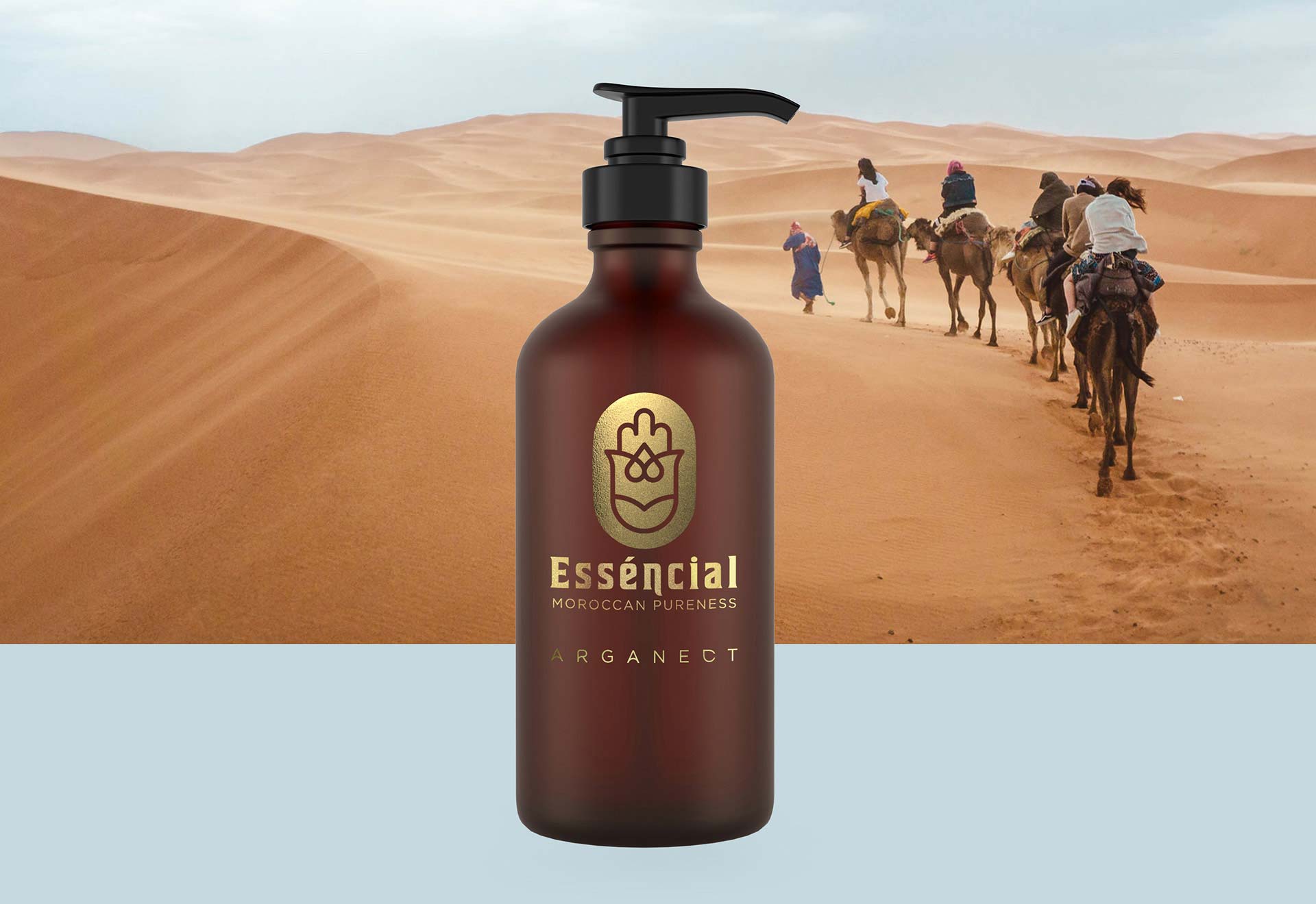
Esséncial is a new cosmetics brand that stands out for products strongly characterized by a high-quality standard. It aims to guarantee the maximum naturalness of the ingredients and particular attention to maintaining the purity of the production processes, according to the ancient traditions of the Berber communities living in the deserts of Morocco.
THE MISSION
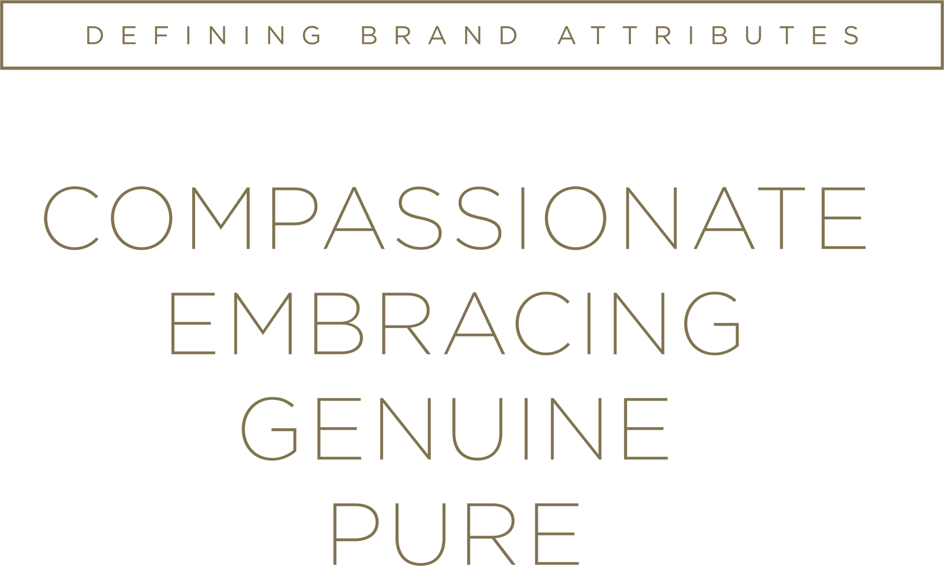
Building the brand from scratch, defining a brand personality and aesthetic language according to their story and values. Being consistent in the whole communication and helping the brand to launch a key product that can trace the guidelines for the development of an entire family of subsequent products.
THE OUTCOME
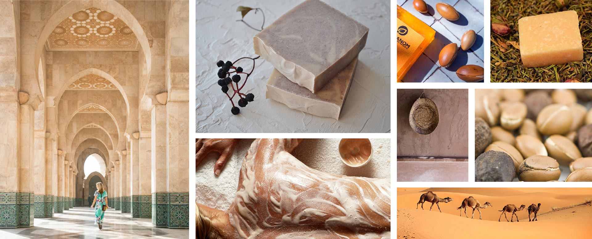
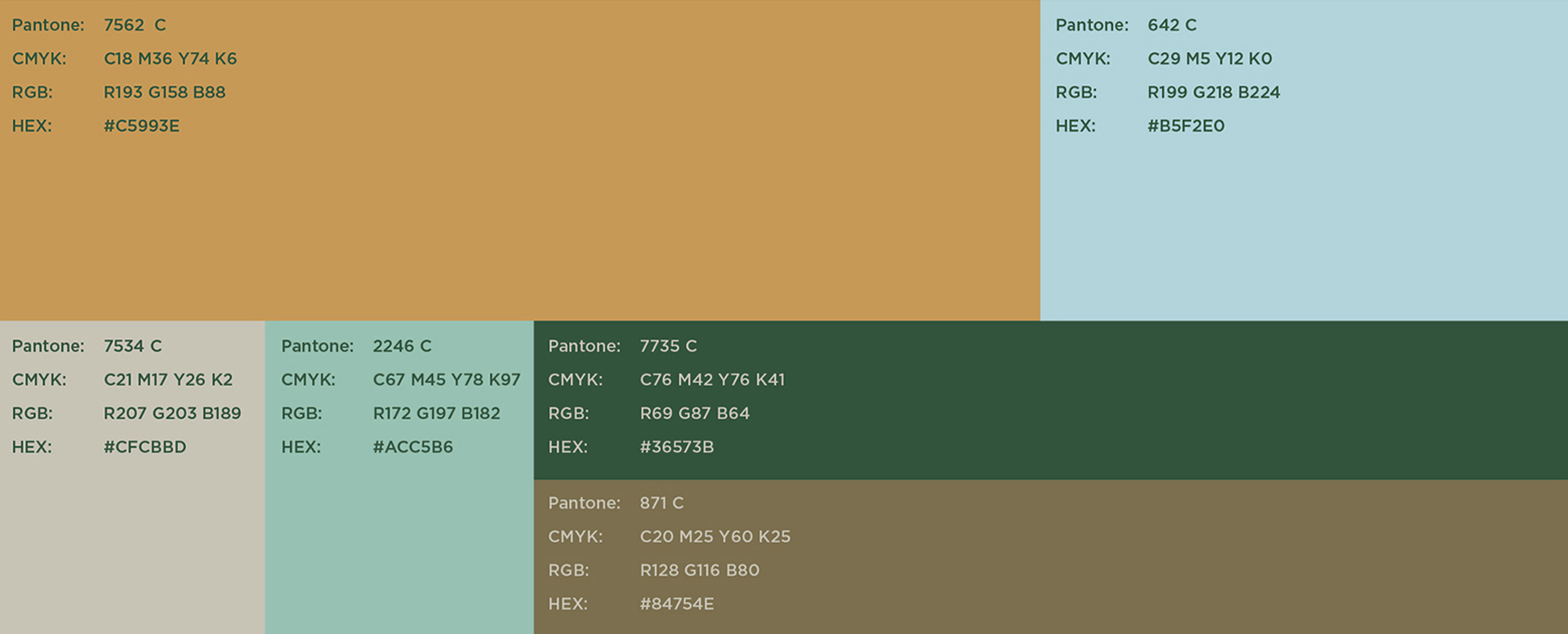
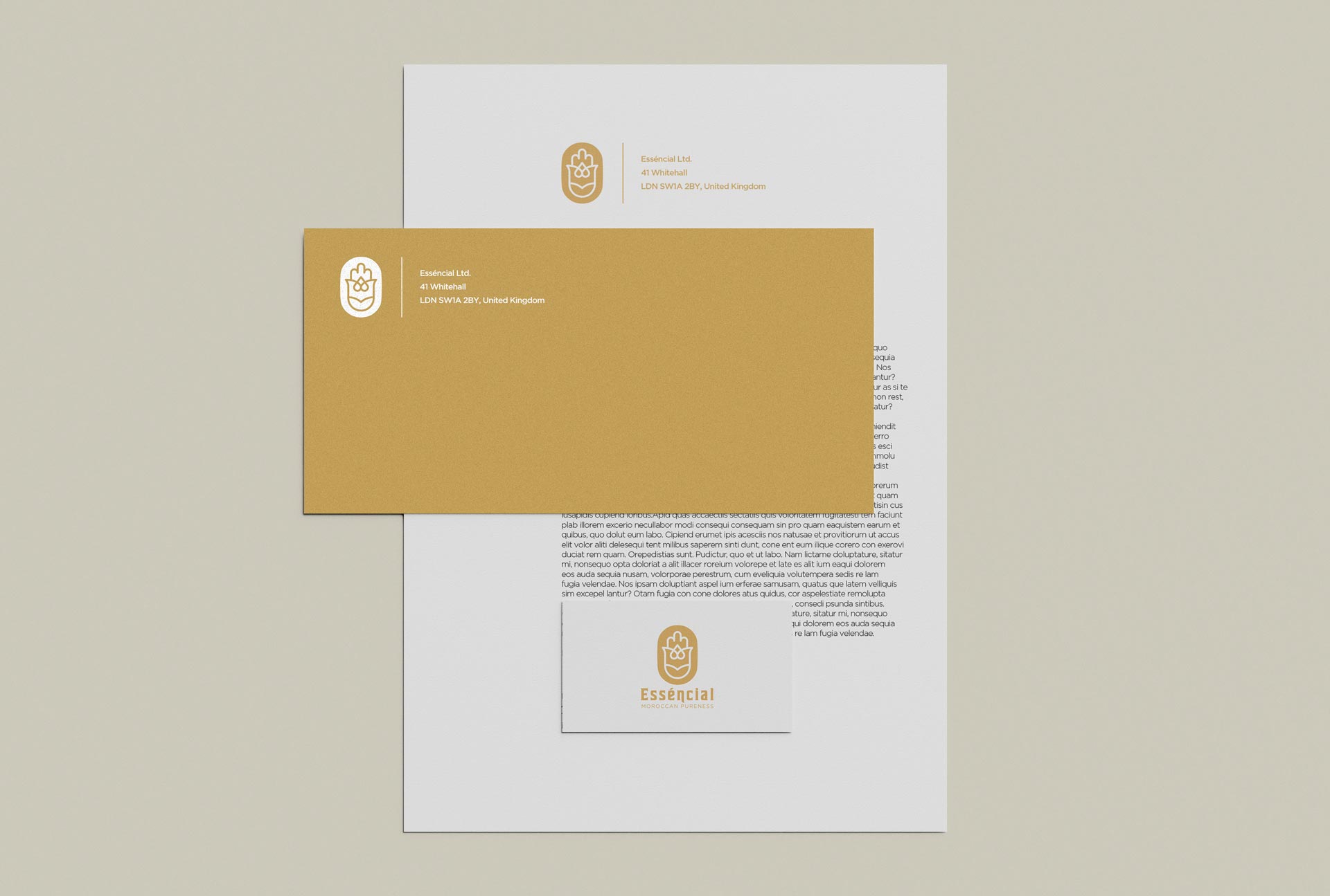
The action of the design process first had to veer to the development of naming and a logo that could resonate with the brand's spirit. Subsequently had to set a mood that could be declined under all aspects of communication.
THE SYMBOL
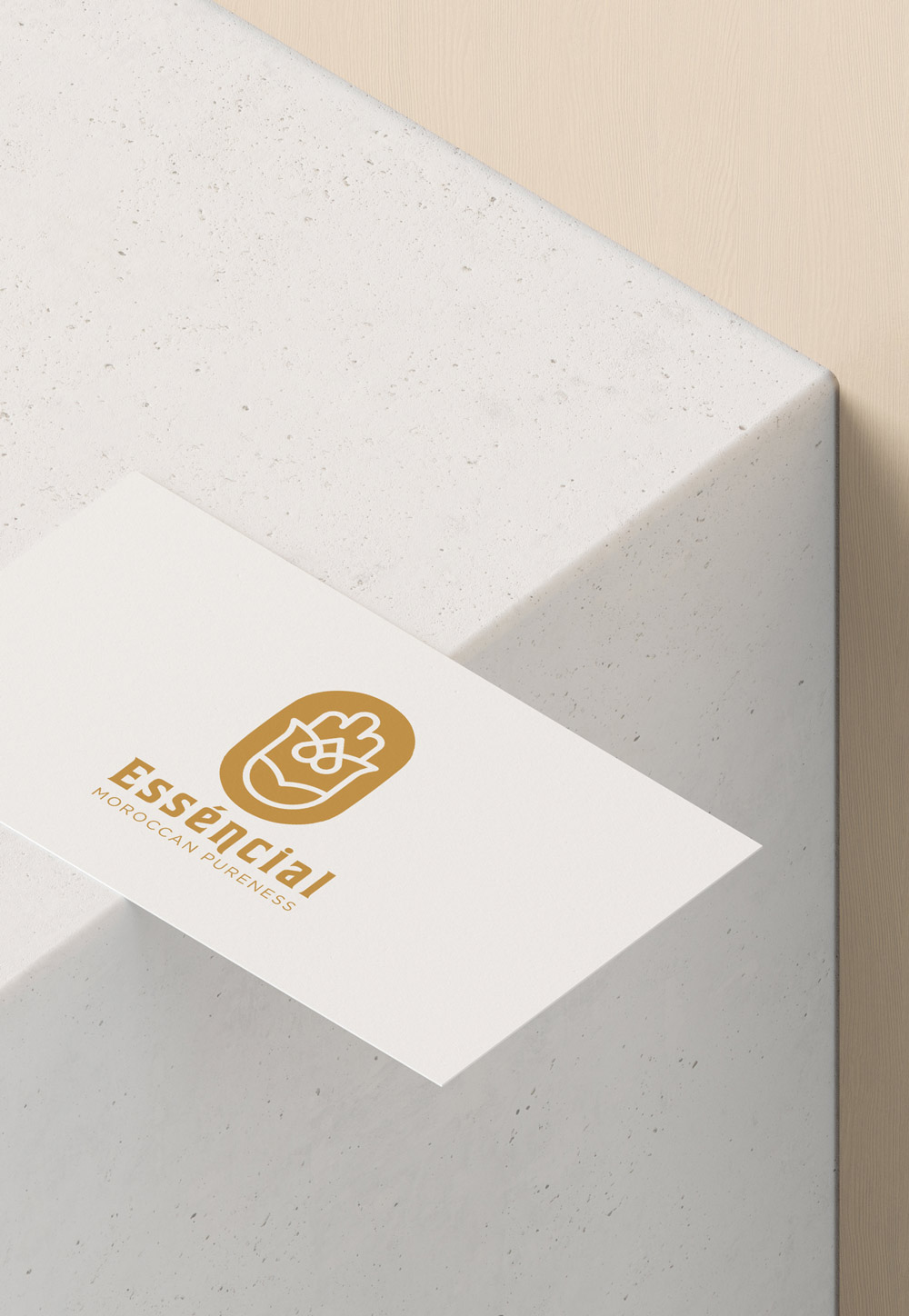
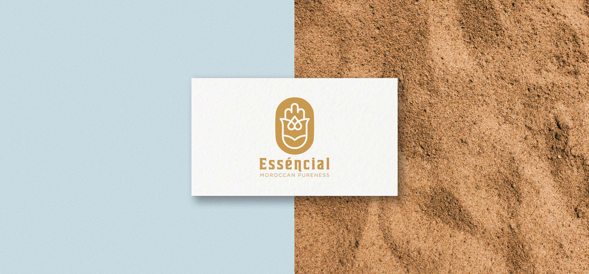
This pictogram was born taking inspiration from Islamic iconography. The main symbolic element refers to the Khamsa: the hand of Fatima, the daughter of Muhammad. The hand is also a reference to the world of cosmetics and human intervention in the creation of completely handmade products. The leaves and the blossom are communicating naturalness and beauty. Finally, the heart, which is intertwined like an ornament, becomes part of this multitude of symbols that are merged together into a unique mark.

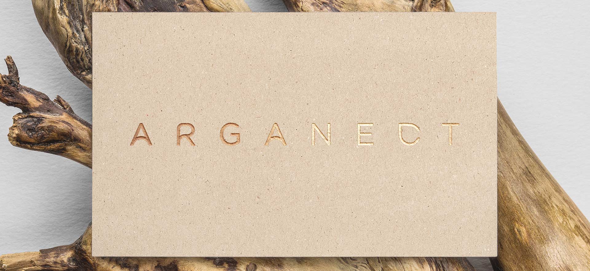
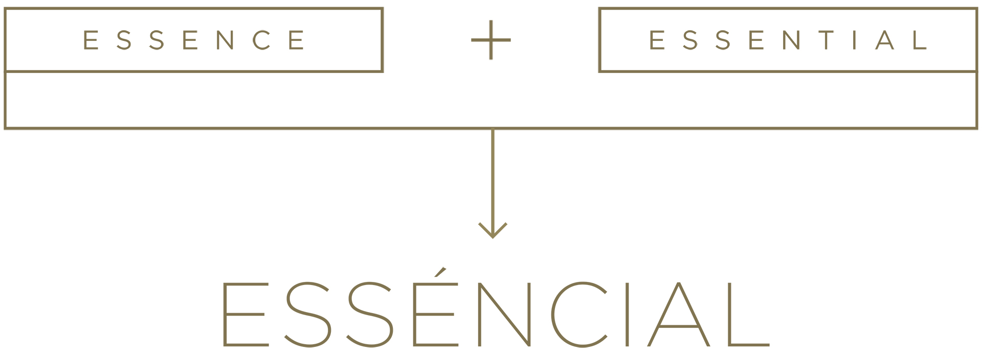
The first core product is 100% pure argan oil which is called Arganect. The name comes from the word nectar because of the appearance of this product, indeed also called liquid gold. According to Greek mythology, nectar was used by the gods to heal themselves, to support their youth and immortality.
A typographic connotation was also given through the creation of this logotype specifically designed to create a greater sense of product identification.
The shapes of a drop of water covertly become part of the lettering, creating a connection with the concept of nectar.
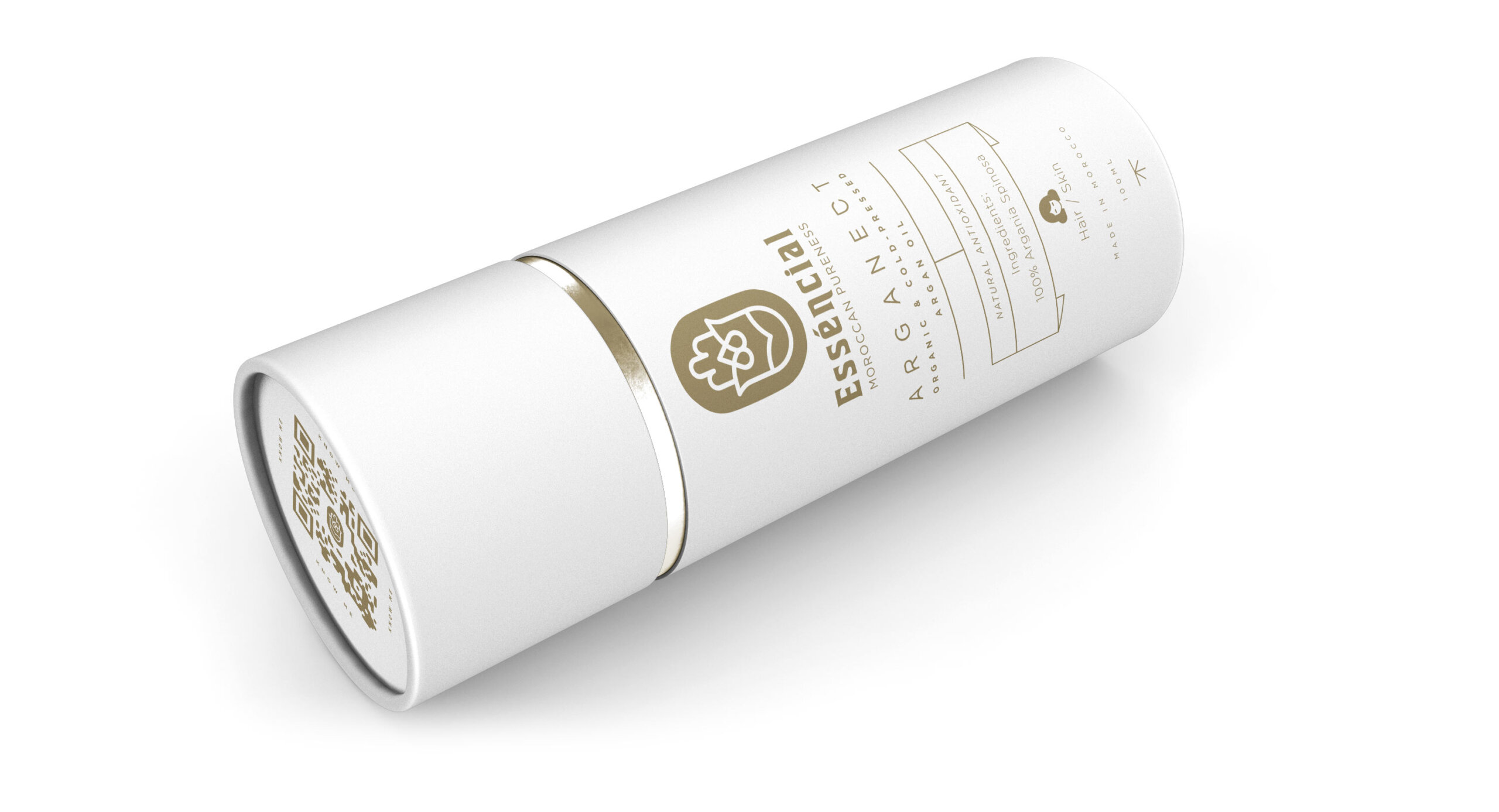
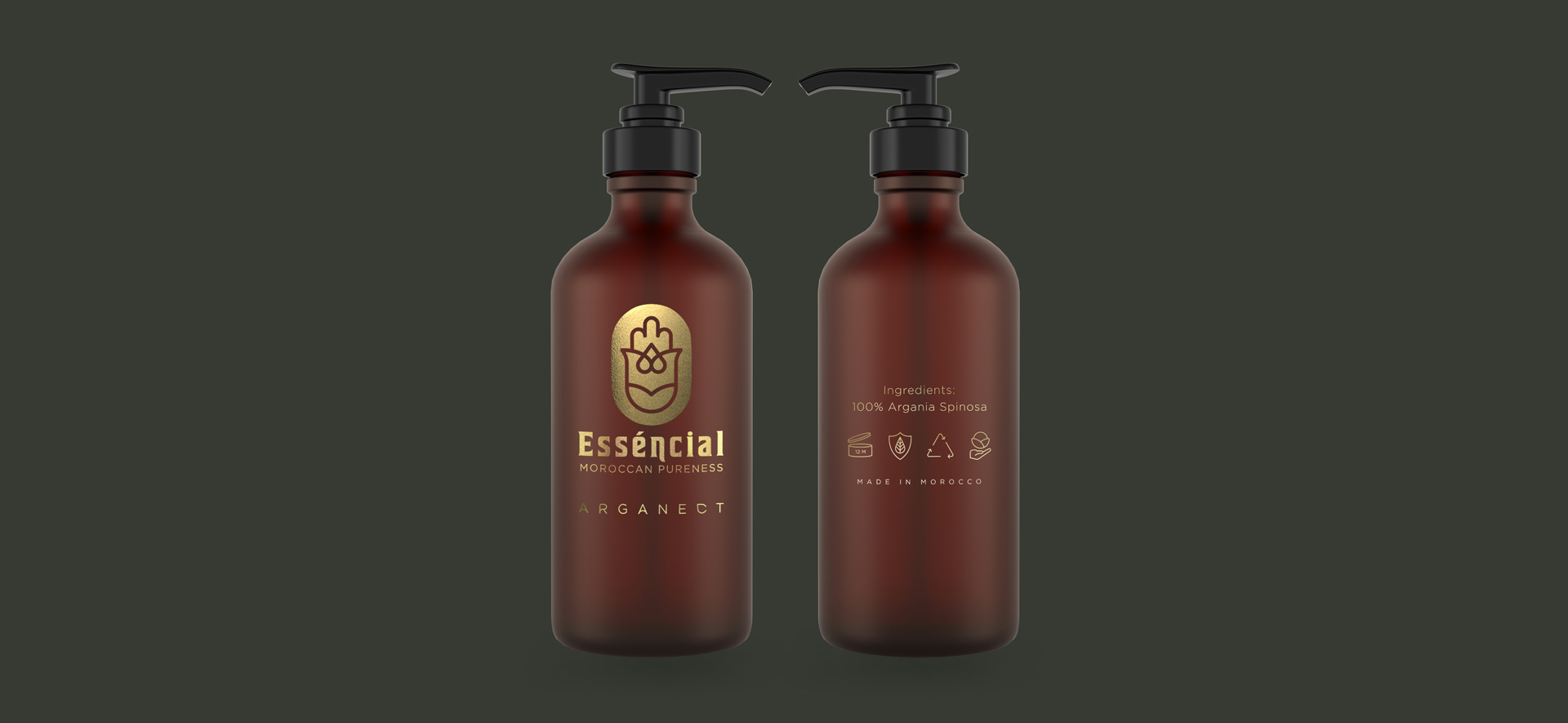
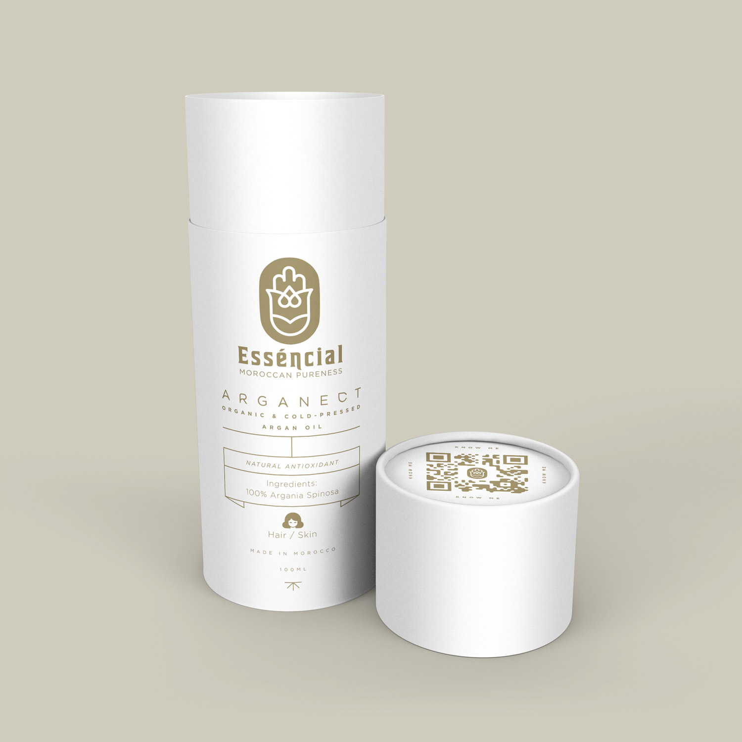
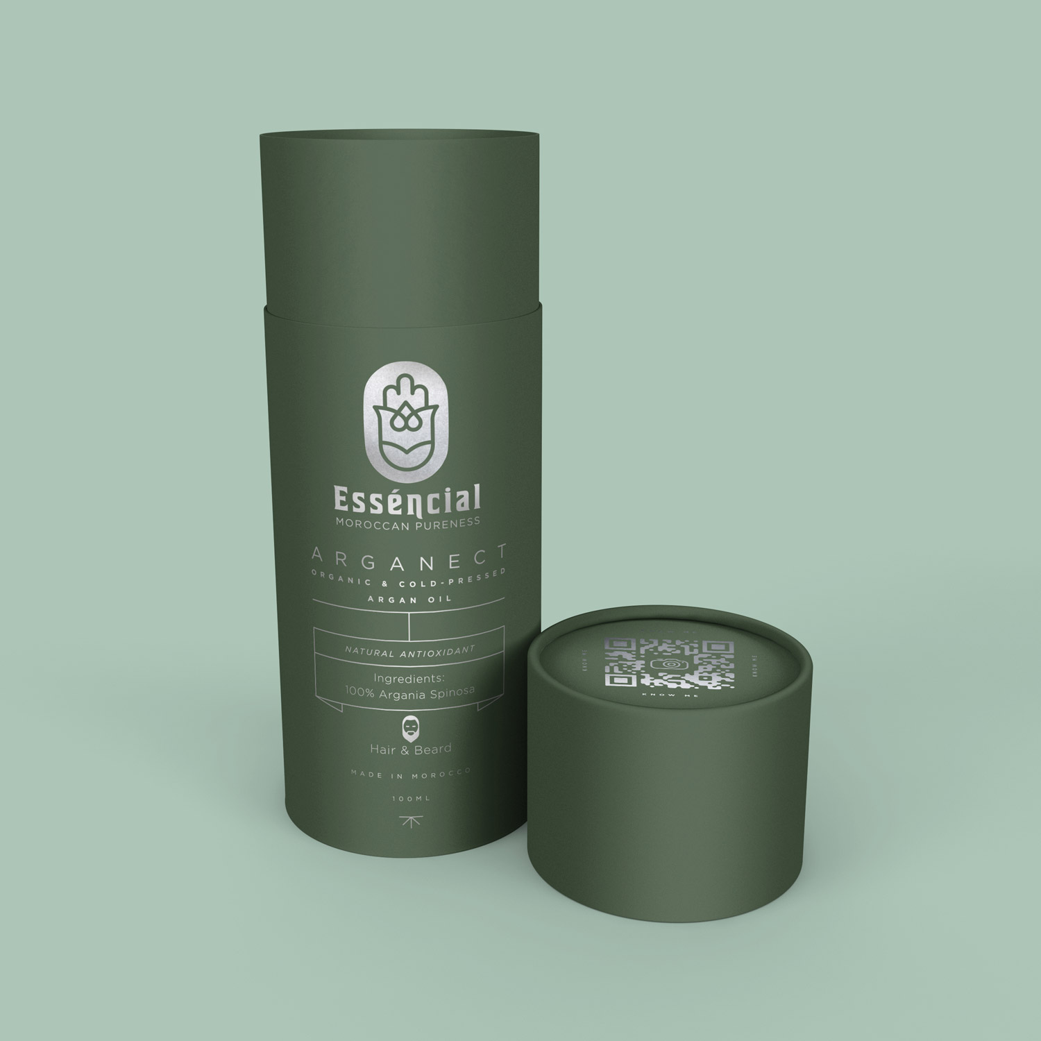
The next step after defining the Brand Image was to launch a key product that could set the style guides for an upcoming product-line. The result is packaging rooted in minimalism, clarity & elegance which keeps a strong brand consistency.


