KOUKOU
The Healthy Cafe
Deliverables
Logo
Visual Identity
Koukou is a greek coffee shop that aims to position itself as a reference point for the health-conscious consumer who likes to indulge in the sweet taste of pastries and coffee beverages while remaining healthy.
Coconut sugar, honey, molasses, agave syrup, stevia, and maple syrup are some of the alternatives to sugar they offer and use in their products.
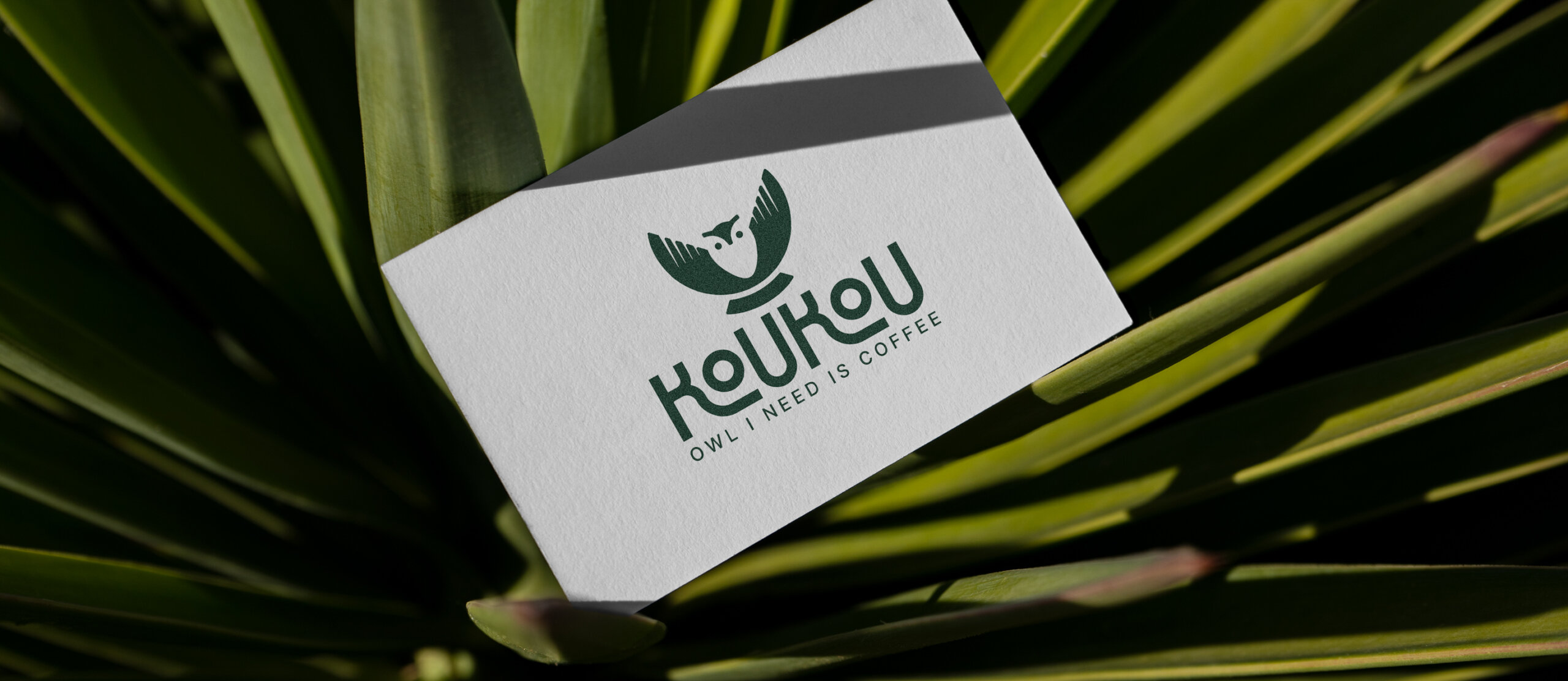
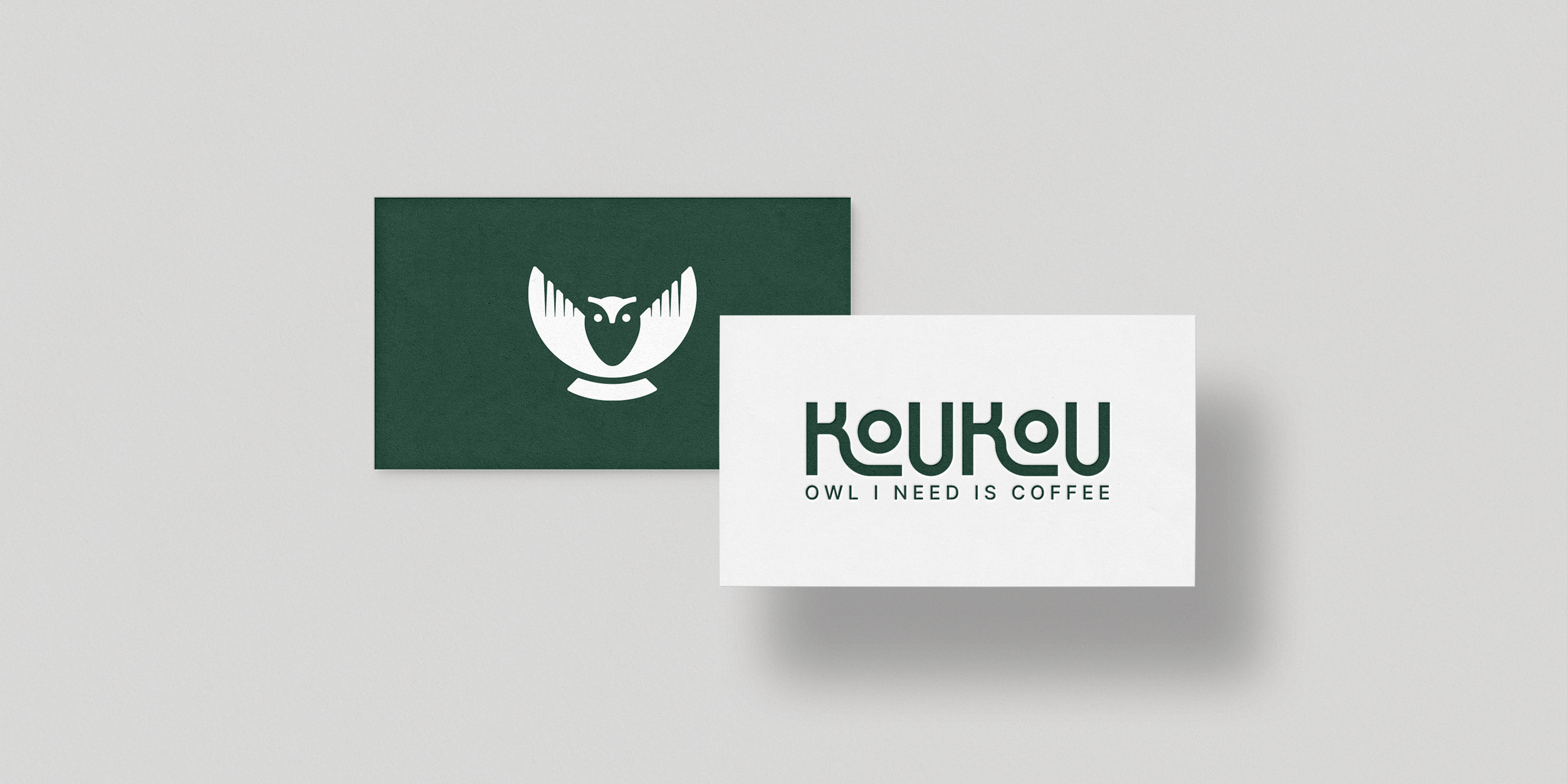
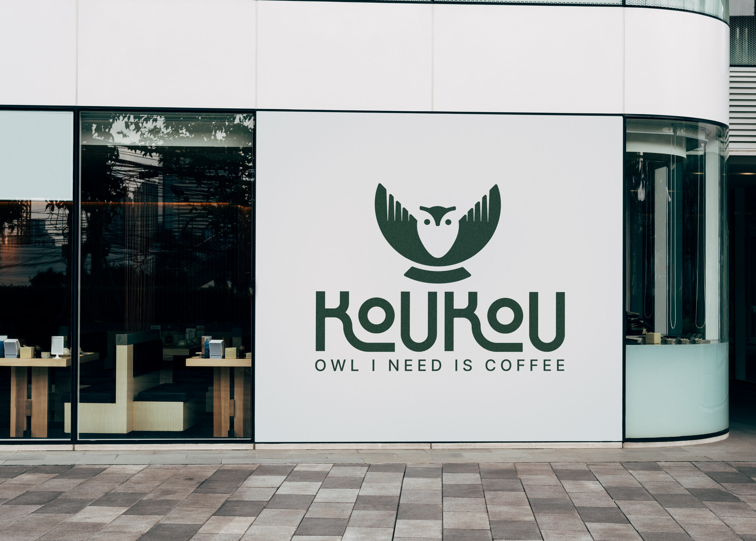
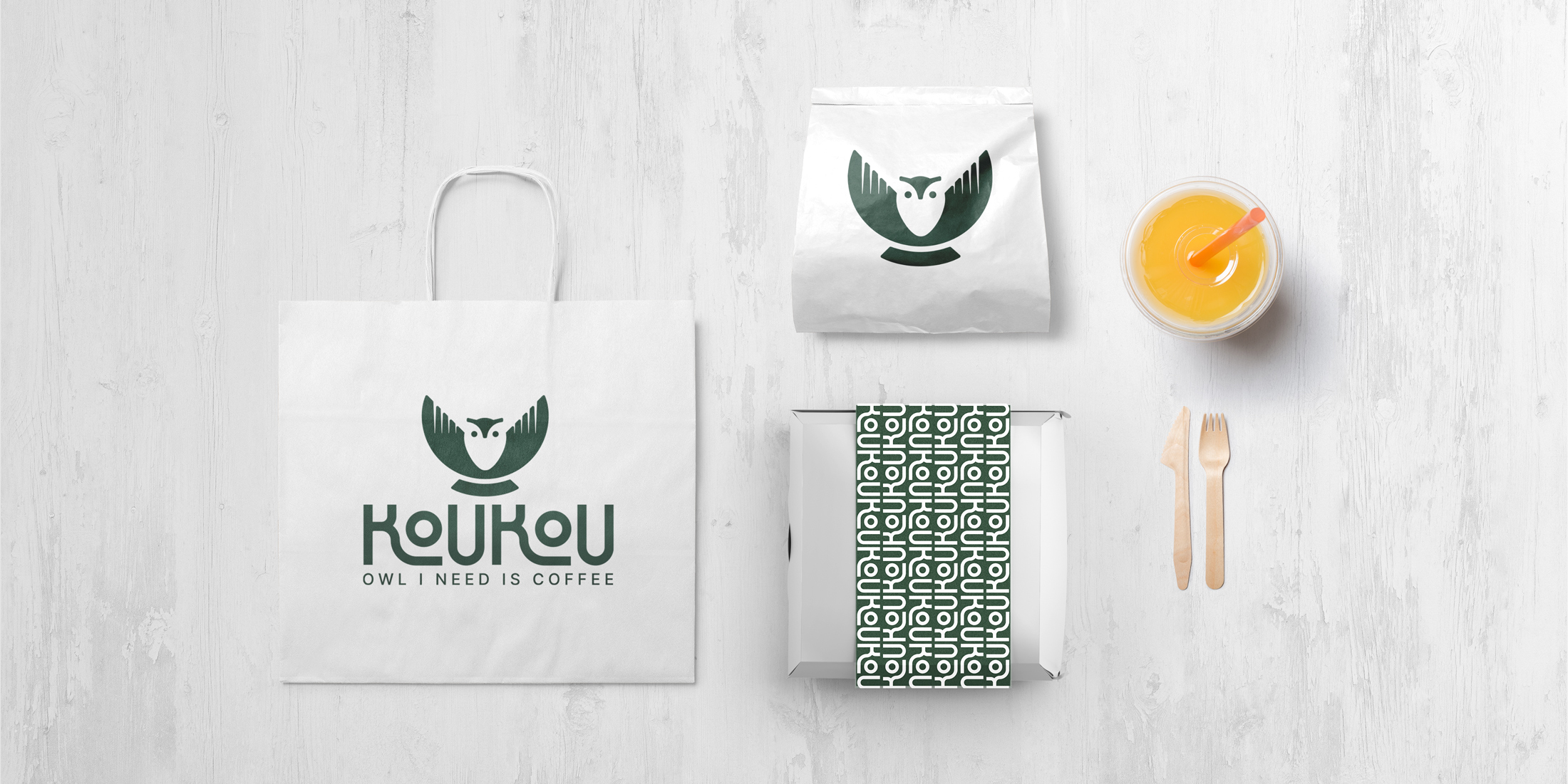
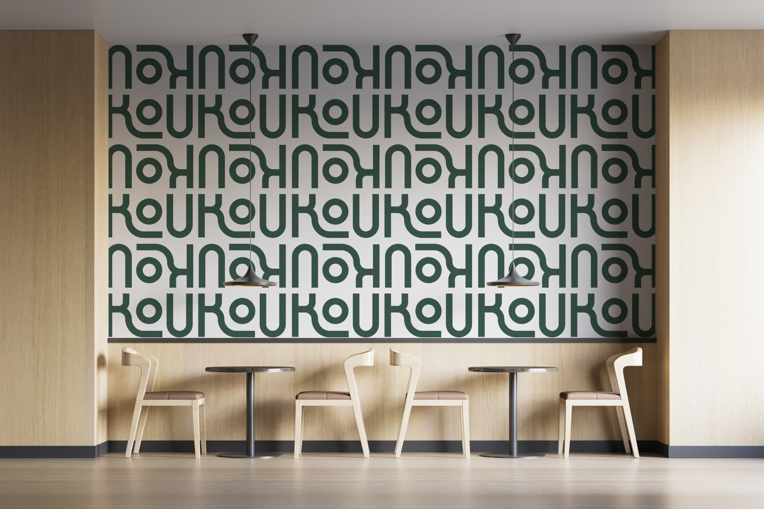
The goal of the logo was to create something very distinctive and impactful. It all began from the lettering process: the logotype has been drawn from scratch to obtain something dynamic but compact. The letters mix into a heterogeneous but cohesive whole, which resembles a pattern. It is a subtle citation of the Greek geometric patterns, but it doesn’t appear in a clichè way.
The symbol stands out for its clean and minimal shape, comprised of three elements: the wings of the owl, which include a counter-form of its body created by negative space, the head, and the tail at the bottom.
The peculiarity here is its shape which also subconsciously reminds of a food bowl.
