LA PERLA
Italian Restaurant
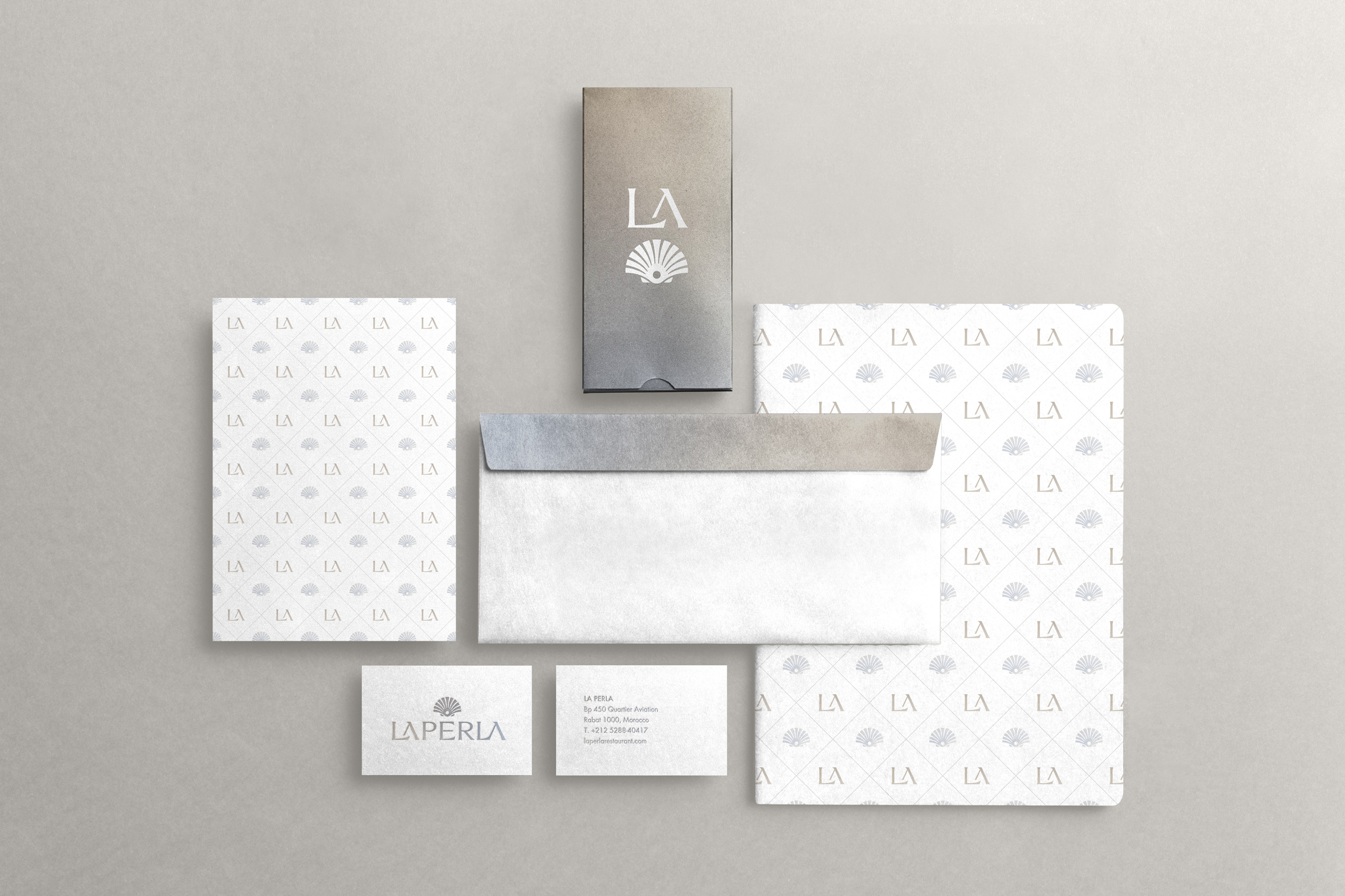
Deliverables
Naming
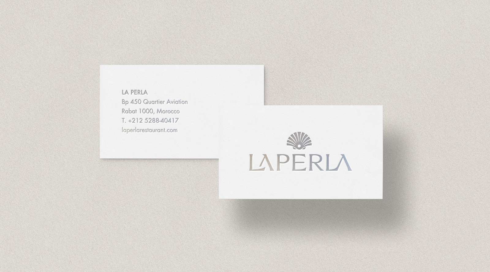
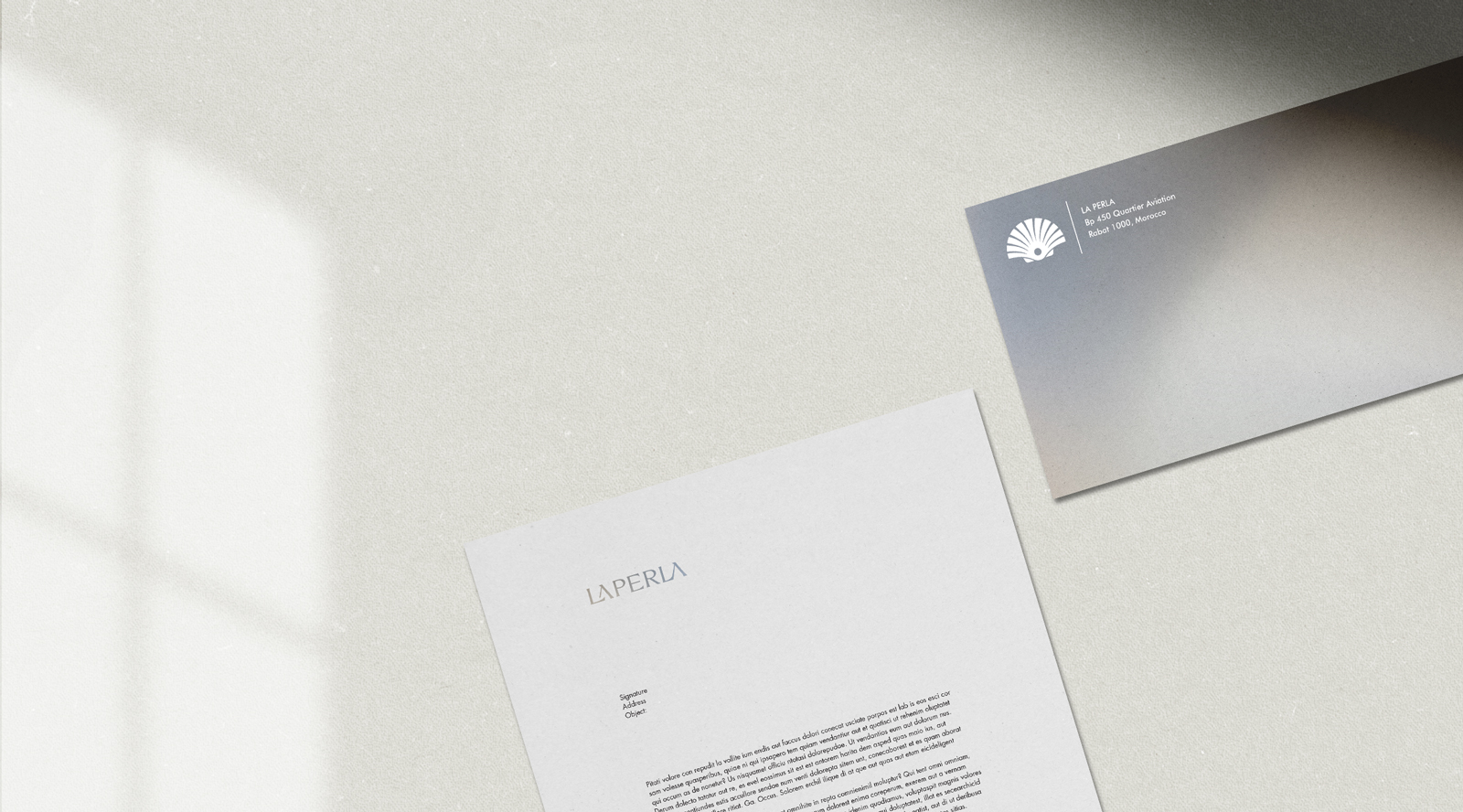
Logo
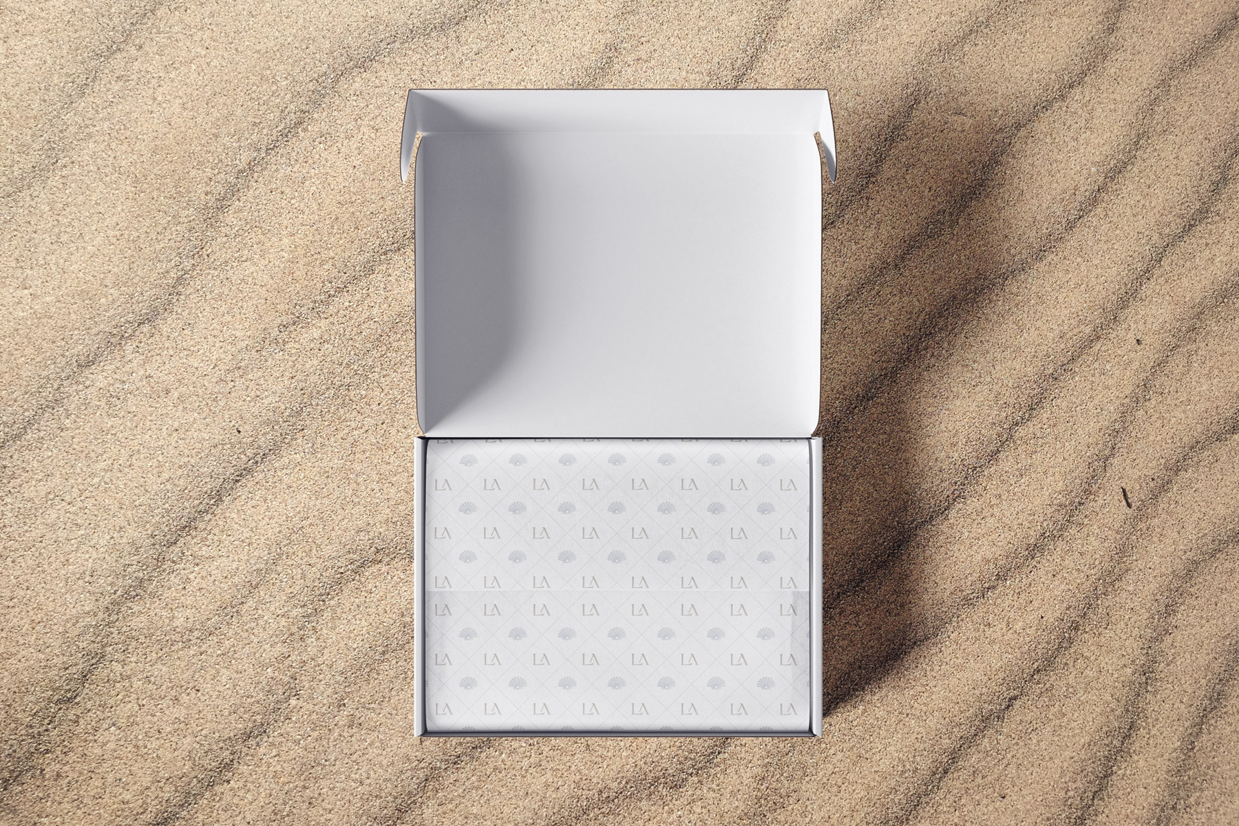
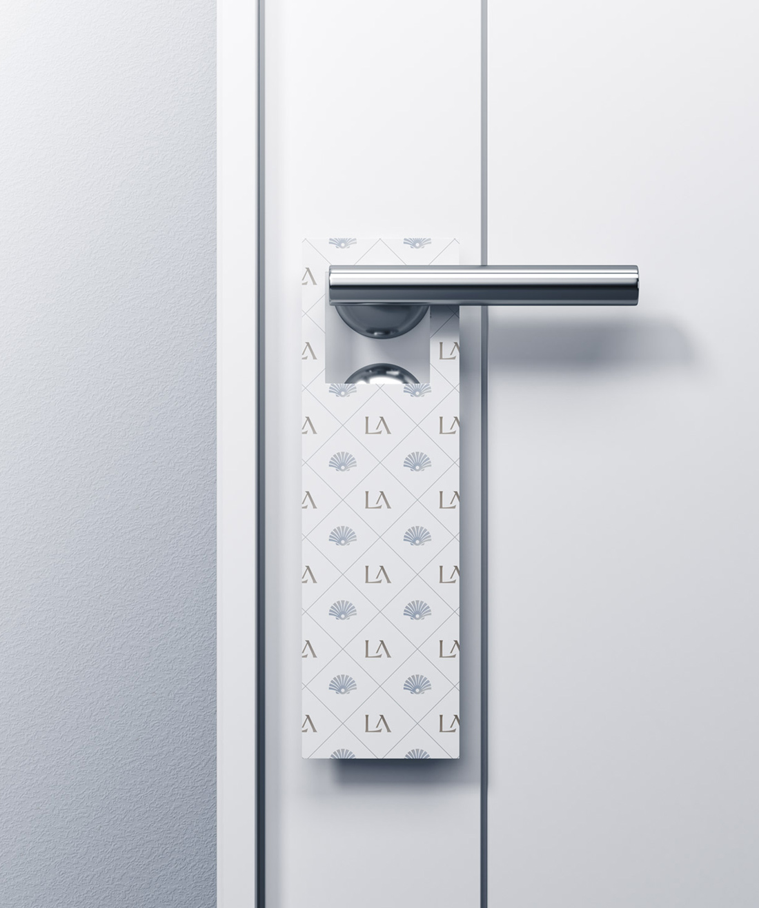
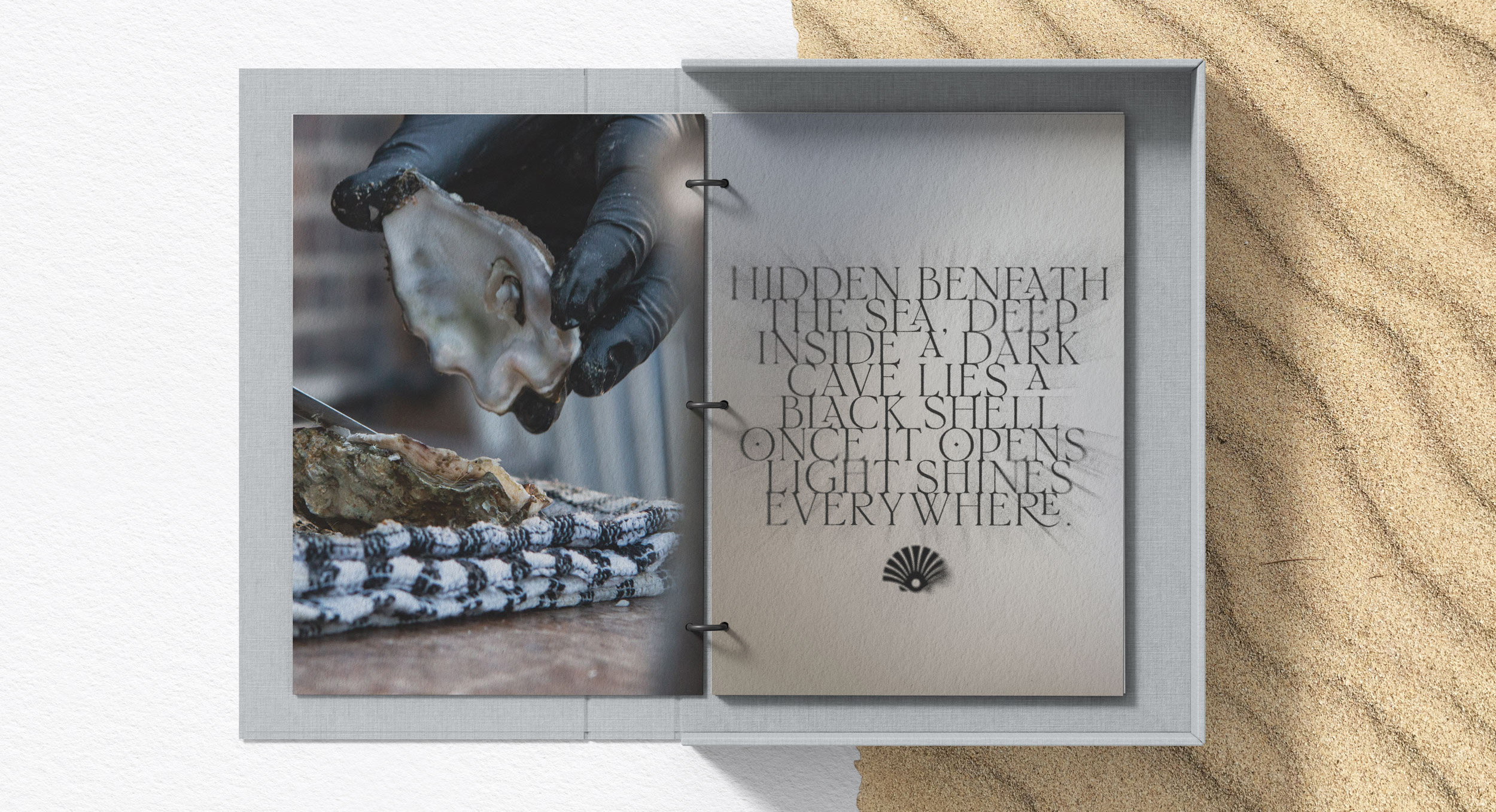
Visual Identity
The project's goal was to create an identity for an Italian restaurant in Moroccan territory. The language had to be sober, elegant, and sophisticated. The name had to give a sense of Italianness, and it had to be understandable even by a foreign target. It was necessary to avoid highly recognizable "Italian-clichè words" or words that were too difficult to understand by a non-Italian target. The result is a simple name, phonetically similar to the French pronunciation.
The logo was created by customizing the letters. The first two letters (meaning 'the') are joined by a ligature which made it possible to bring them optically closer to the second part of the name: 'PERLA' (meaning 'pearl'). The final 'LA' letters have been combined in a new way to break up the rhythm and create a sense of tension.
INSPIRATION

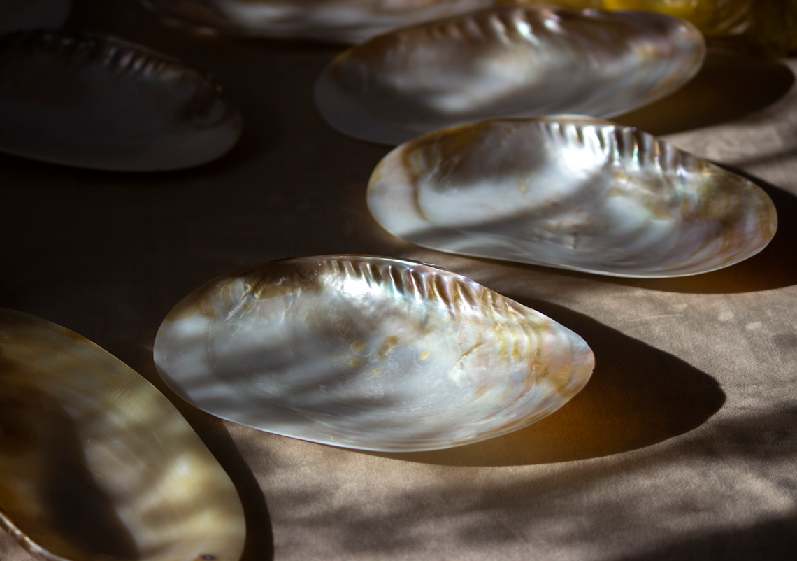
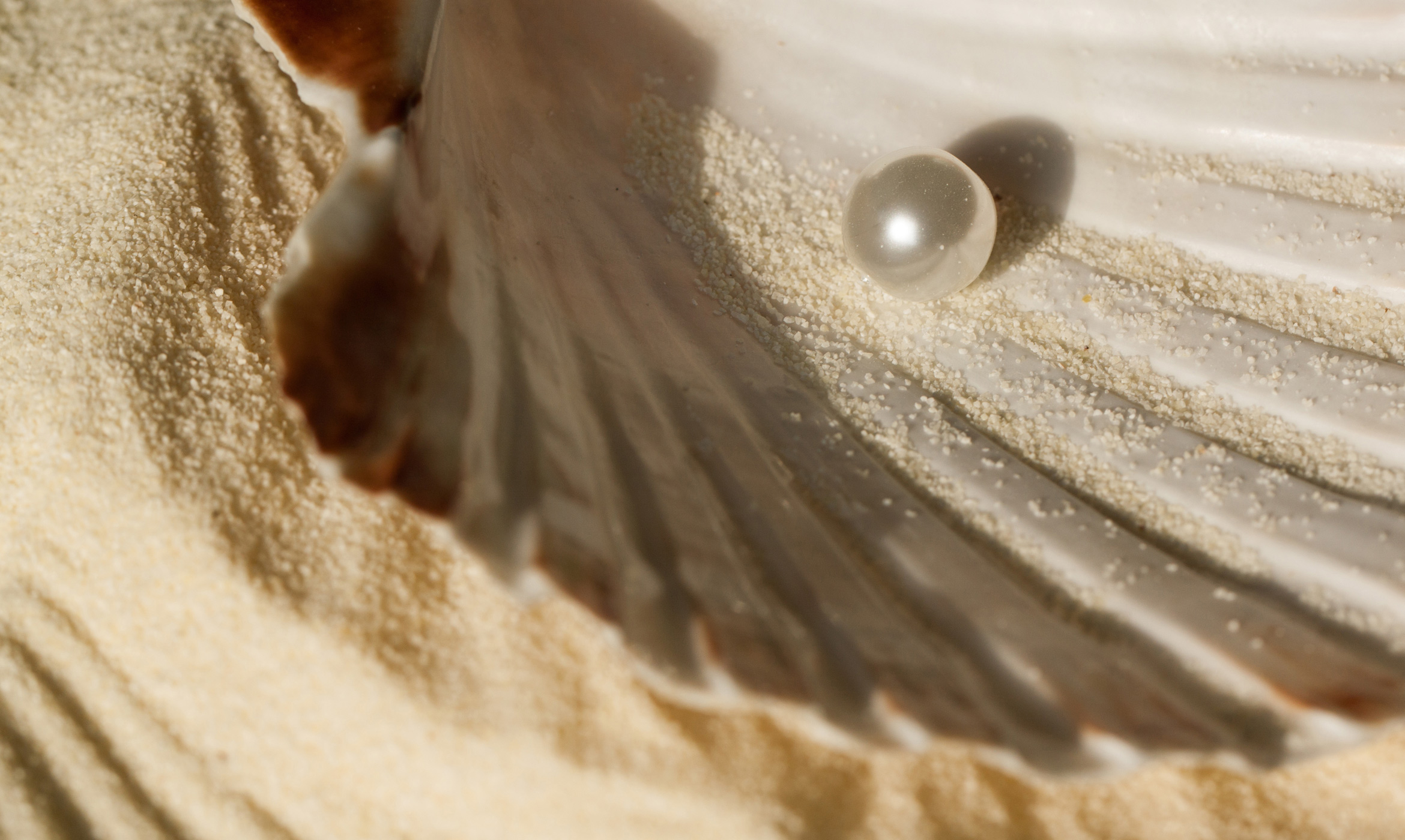
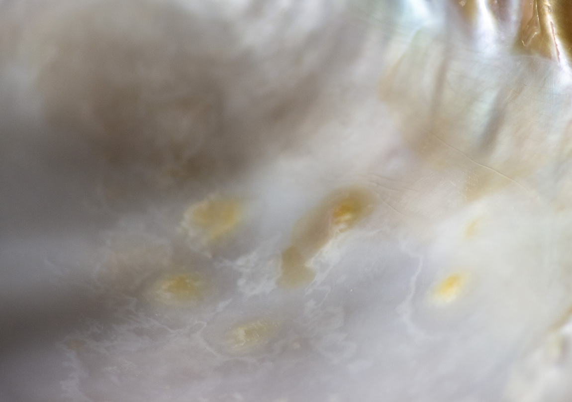
This proposal is inspired by the shape of the shell and the colors of mother-of-pearl. The result is a color palette that simulates the typical iridescence of this material.